Redesign for the National Library search engine
How we redesigned and shipped a new search experience for the National Library based on user needs
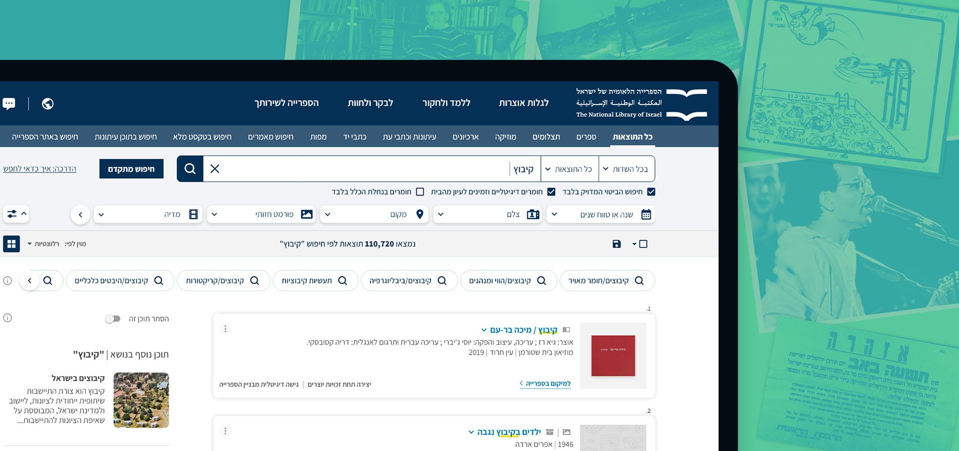 NLI search system redesign
- 2021-2022
- UI, UX, prototyping, visual research, mockups
- Beta version (live)
Introduction
Search lies at the heart of the library as a digital archive, supporting its mission of providing accessible digitized materials. I believe that in our digital era, an effective search experience is crucial for libraries.
Goal
The National Library of Israel currently uses the “Primo Ex-Libris” out-of-the-box (OTB) solution as its main catalog search engine, with minor tweaks implemented over the years. Our primary goal was to enhance the UI and UX of the OTB experience based on user feedback, align it with the new Design System, and launch a beta version to direct at least 5% of the overall traffic to the new search experience for further testing.
User Research
The goal of the user research was to understand what worked on our current search page and what did not. We collaborated with our product managers to leverage the research results and provide the best UX solution.
The research included two parts, a satisfaction survey, and an in-depth questionnaire. Overall, 592 users took part in the survey, and 76 of them answered the in-depth questions.
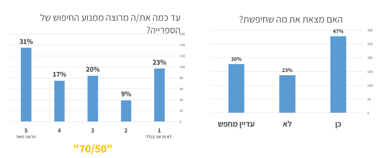 Survey results: the average satisfaction level with the search experience is medium (3.3), 50% couldn’t find what they were looking for.
Here are some of the user feedback quotes:
“Is the book X digitally accessible?”
“There is an online book, but it says I can not view it because I do not have permission! So why are you putting it in the catalog? For beauty?”
“There is no way to browse through author lists, which makes it very difficult to find a particular author whose last name is known but whose first name is unknown.”
“The spaces between the items and the rows are very large, and you have to scroll a lot to get to the items. In my opinion (and I work and have worked with five library programs) it’s better to have more items on the page…”
“Sometimes you have to try a lot of keywords to search to find a result that was supposed to be available in the keywords you tried before”
Key research conclusions
Satisfaction level
- Average satisfaction level with the search experience was medium (3.3).
Digital availability
- Many users search for digital materials accessible from home but are frustrated by both the lack of available materials and the inaccurate marking of results.
Search properties
- Users of the in-depth survey, mostly researchers, search for books as well as other relevant materials (no longer just books!).
- Users are equally divided between those looking for a particular item and those searching for items on a particular topic, and both scenarios need to be addressed.
- There is still a demand for catalog information; about 40% of those who responded to the in-depth survey searched for this type of information for various uses (not just “planning a visit” to the library).
Usability
- Users wanted to see more results without the need for additional loading or browsing and to get more information on the screen to save scrolling.
- There was a request for less “sensitivity” to typos and autocomplete.
UX Goals
Based on the research conclusions, we set the following design and specification goals:
- Create a new and improved search interface that allows for quick visual scanning and is adapted to different types of material.
- Enhance predefined search capabilities (e.g., author only, title only) through autocomplete functionality.
- Refine and improve search filters.
- Consolidate all types of materials into the main search.
- Improve the accuracy of the “online access” indicator.
- Enhance the sorting of results through a more effective ranking mechanism.
- Strengthen topic-based search capabilities, including suggesting more topics and implementing auto-completion.
- Integrate different types of results (e.g., events, blog articles) while maintaining a clean results page.
- Improve existing morphological mechanisms (e.g., Morfix).
Mapping existing features and examining options for new ones
In collaboration with the PM, we developed a feature table to thoroughly understand the scope of work and the functionality of each feature, both existing and those proposed for addition.
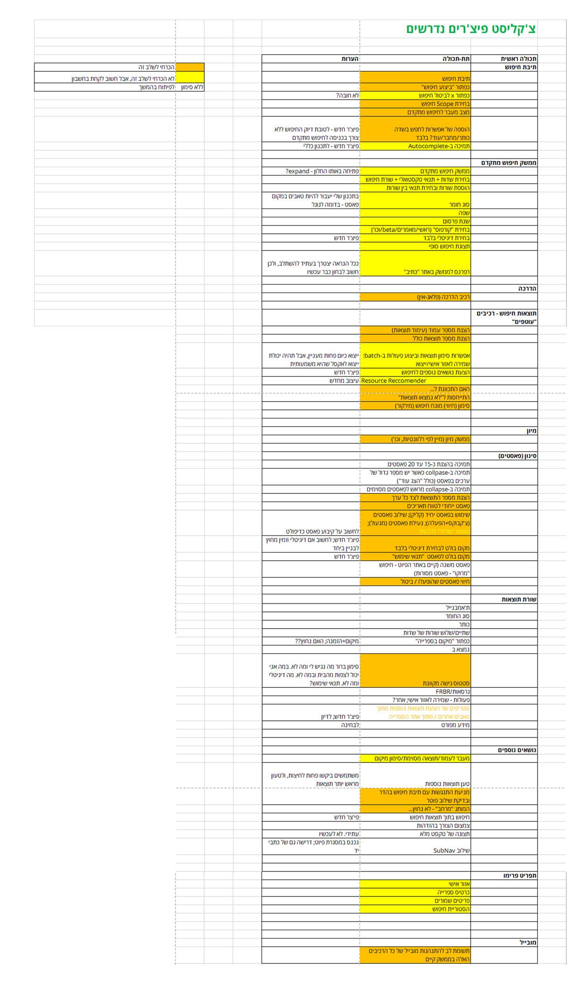 Feature checklist
Competitive research/benchmark
While mapping features, I reviewed approximately 30 result pages from online digital archives, libraries, and major e-commerce websites to evaluate various solutions that enhance the search experience. Our primary reference was Google.
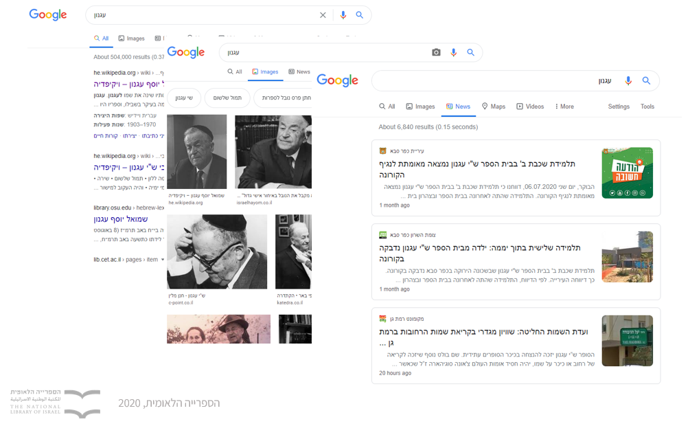 Various search solutions
Benchmark highlights
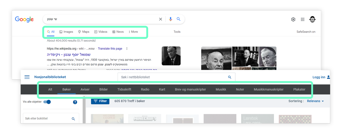
Results types display
The most common way to display different type of results was tabs
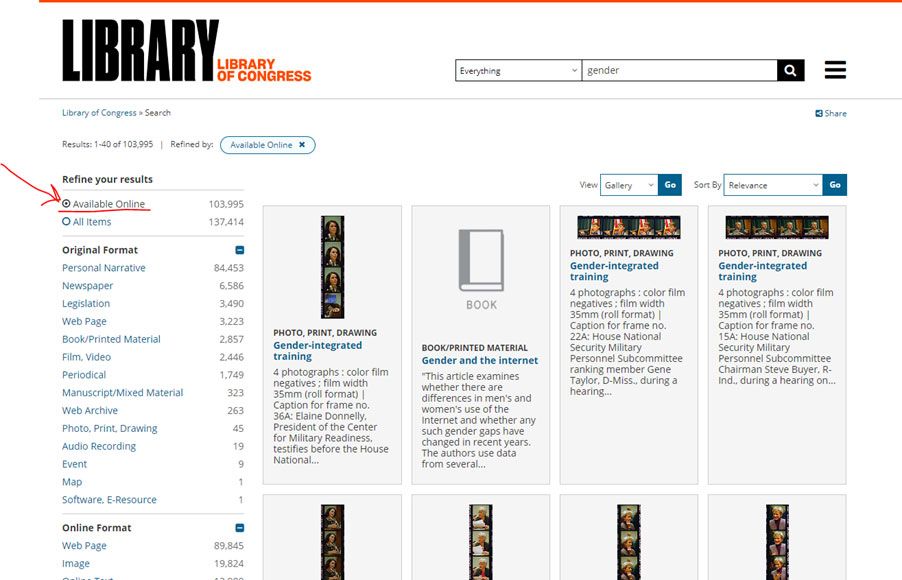
Online access
One effective way to highlight this feature is to position it prominently at the top of the filters, similar to the approach used by the Library of Congress.
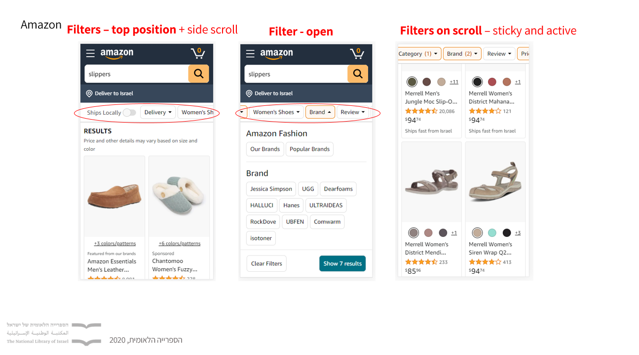
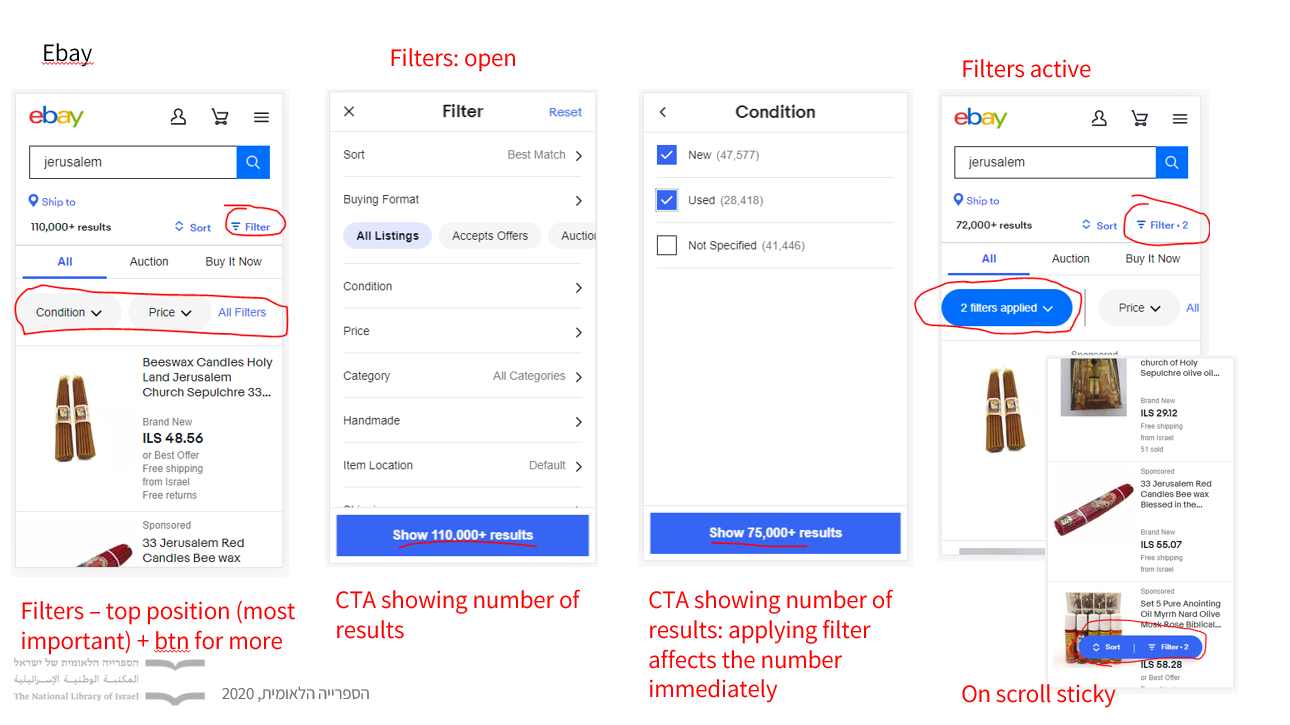
Filters position and behavior
Ebay and Amazon likely place filters in sticky bars to enhance discoverability.
Design explorations
My design colleague and I explored two major design versions: Version A, featuring filters in a sidebar, and Version B, with filters positioned at the top of the page, close to the search bar.
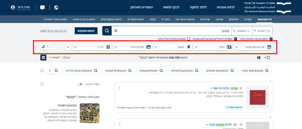 Filters at the top of the page
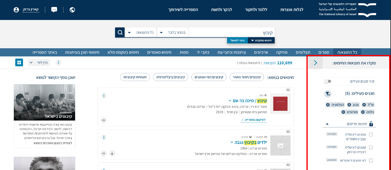 Filters in a sidebar
On one hand, placing filters at the top of the page improved discoverability of the facets. On the other hand, research indicates that users generally dislike horizontal scrolling, and a large number of filters could exacerbate this issue.
Feature highlights
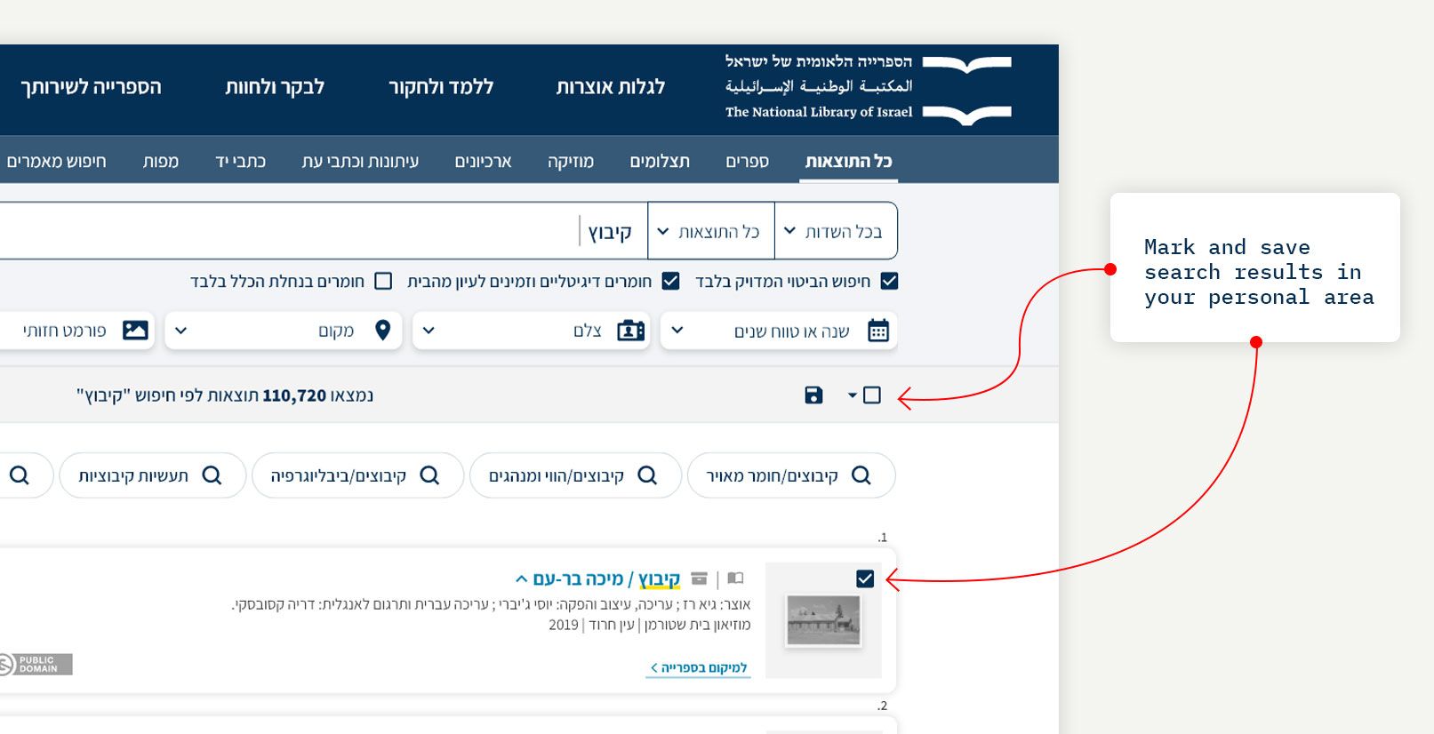
Summary
What Was Done:
- Updated the overall look and feel to align with the new Design System.
- Created a responsive, trilingual design, including a previously missing mobile version.
- Improved user experience by leveraging user research results
- Successfully navigated the set 5% users to the updated page
- Continue monitoring metrics post-launch for ongoing improvements
After the release, we received substantial positive feedback from both users and within the organization.
Credit to the incredible people I had the privilege to work with on this project:
- Product Management: Danny Streifler, Karin Tzadok
- Design: Shahar Ben Sidi
- Project Management: Eyal Tamam