DagsHub Design System from scratch
Lead Product Designer | 2022 - 2025 | MLOps platform, B2B
Building a scalable system from scratch — solo
In a nutshell: designing from the ground up
When I joined the company as the first designer, one of the dreams of the founders was that the product will look top-notch, and will have an outstanding UX, so one of my early goals was to establish the Design System.
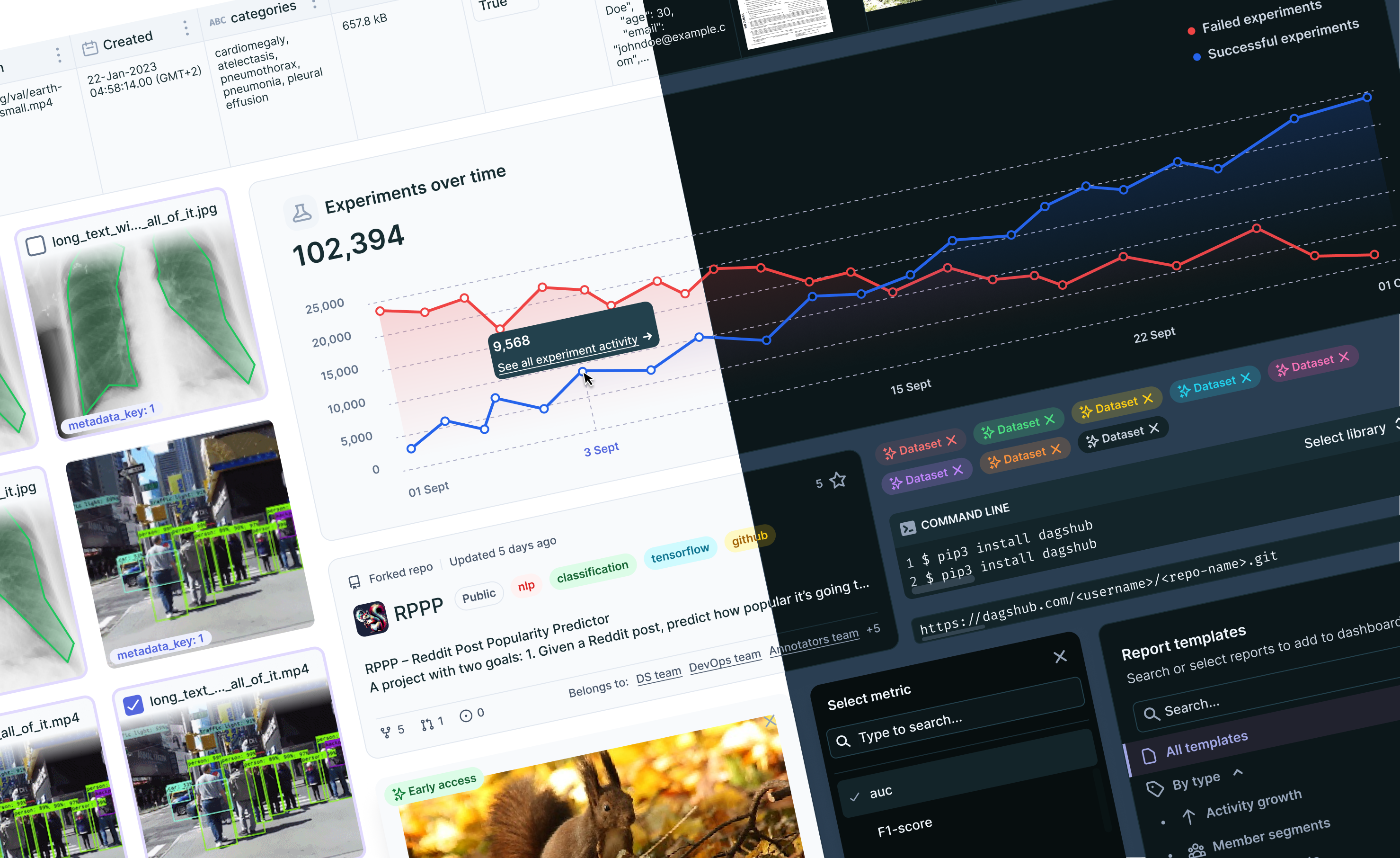
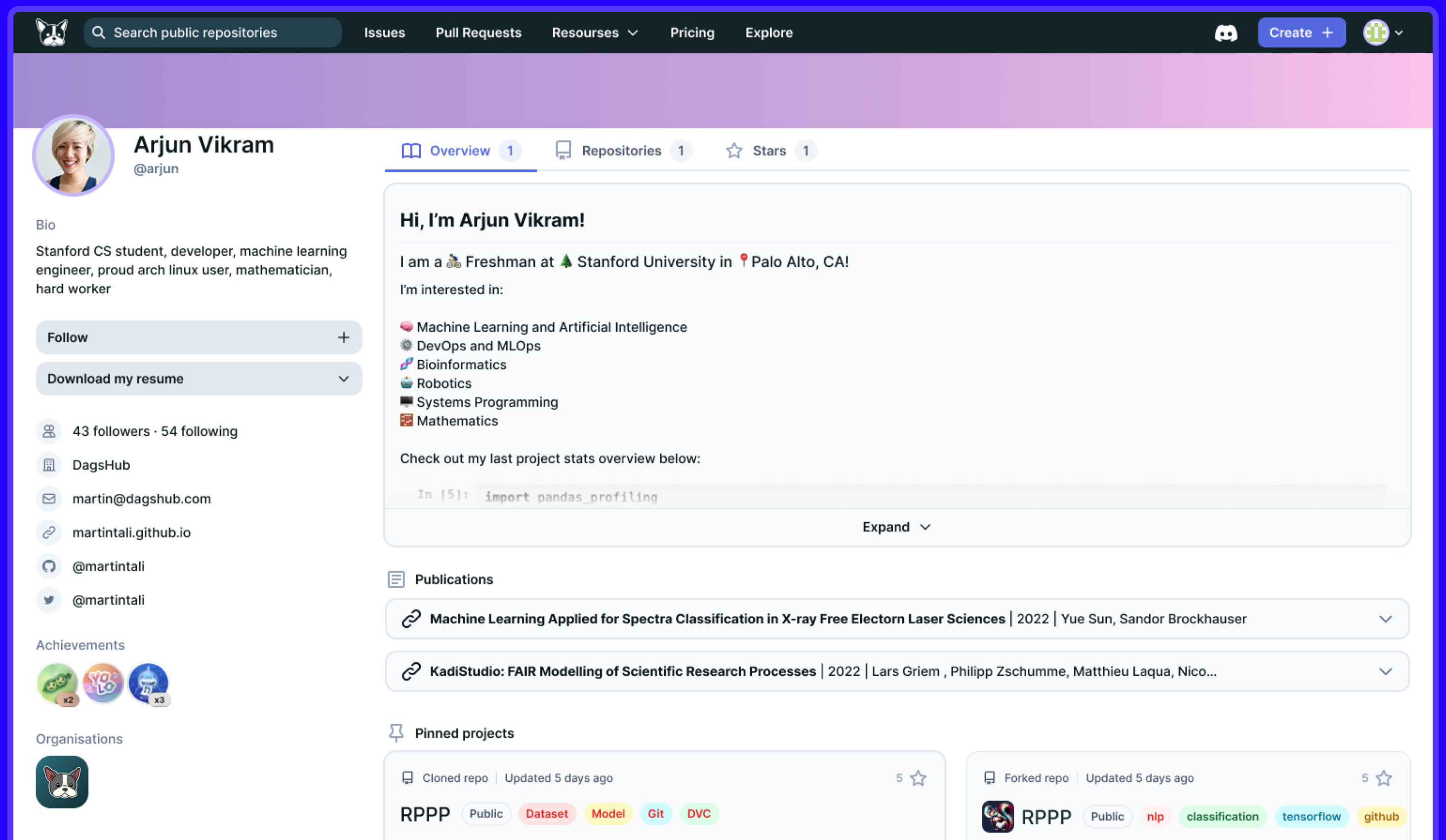
All of the existing system was built like a puzzle, that didn’t fit each other – different parts of the product based on different open-source design systems, such as Gogs, Semantic UI, and others.
In the course of 2,5 years I single-handedly designed, documented and constantly maintained a full library of several dozen components, including adding Light and Dark Mode, after Figma introduced variables, in July 2023.
Planning for velocity
I knew I needed to be ruthlessly efficient, so I mapped out a plan to jumpstart the system:
- Audited the product for existing UI patterns and components
- Benchmarked open-source systems that might save time (Carbon, Tailwind, etc.)
- Defined brand tone via color, type, and spacing decisions
- Validated direction with the team before going too deep
Validating direction with the team
After researching dozens of design systems, I narrowed down two visual directions:
- IBM Carbon – clean, accessible, enterprise-ready
- Tailwind CSS – leaner, more flexible
I mocked up sample screens using both and ran them by the team. The feedback was clear: they leaned toward the Tailwind-inspired option. With team buy-in secured, I moved ahead.
Checking direction for the Design System – Tailwind-based look and feel
Getting off the ground – quickly
To save time, I started with a high-quality open-source Figma library by Gene (based on Tailwind). But many components were designed for marketing sites — too large and loose for a dense SaaS platform. So I:
- Adapted proportions and spacing for app UIs
- Translated styles to variables for dark/light mode once Figma Variables launched
Starting with this template helped me set up the atoms of the system really quickly – choosing color palette, typographic scale, sizing, elevation, breakpoints and so on – it already had React classes in their naming.
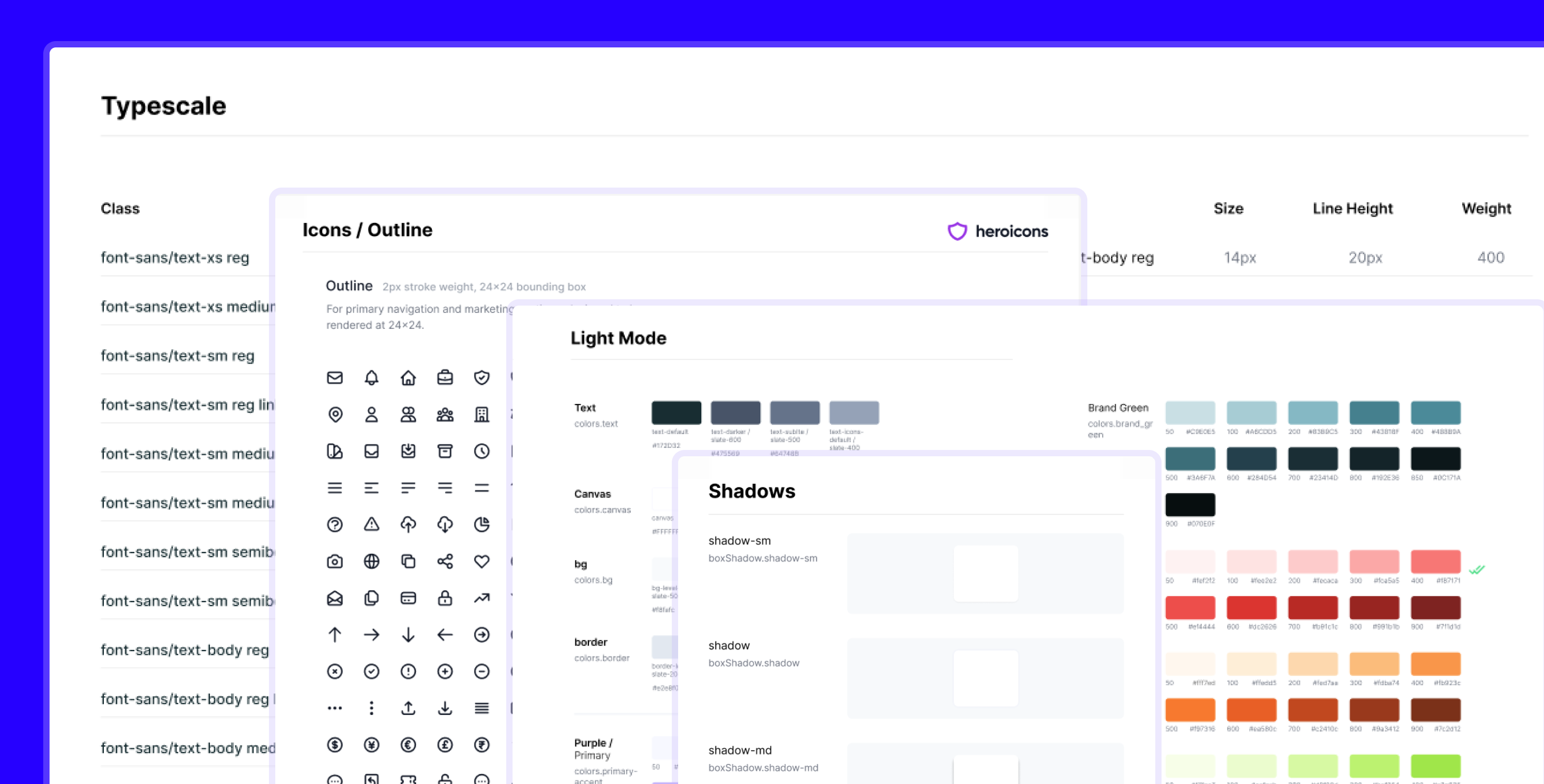
The atoms of the system
Both of these tactics – starting from template design system and creating a sample page to check the design direction and building components for it – enabled me to jumpstart the project.
Within couple of weeks, I already had a solid foundation for my new Design System, including basic components, like buttons, icon buttons, tabs, inputs, accordions and cards.
Growing the system organically
I didn’t build the full system in a vacuum. Instead, I used ongoing design work (new pages and flows) as opportunities to expand the system:
- Each redesign = a new batch of components
- Components were refined over time based on real usage
- This approach let the system evolve with the product
My guiding principles:
- Don’t reinvent the wheel
- Build on real needs
- Improve while shipping via tight collaboration with devs
Implementation & hand-off
A successful design system isn’t just about design — it’s about adoption. For a long time, there was no front-end developer available to partner on implementation. So I:
- Thoroughly documented every decision in Figma
- Left dev notes anticipating future handoff
- Structured the system in a dev-friendly way
Eventually, the system began to be implemented in Storybook. Over time and through several dev transitions, many of the core components were built and integrated into the product.
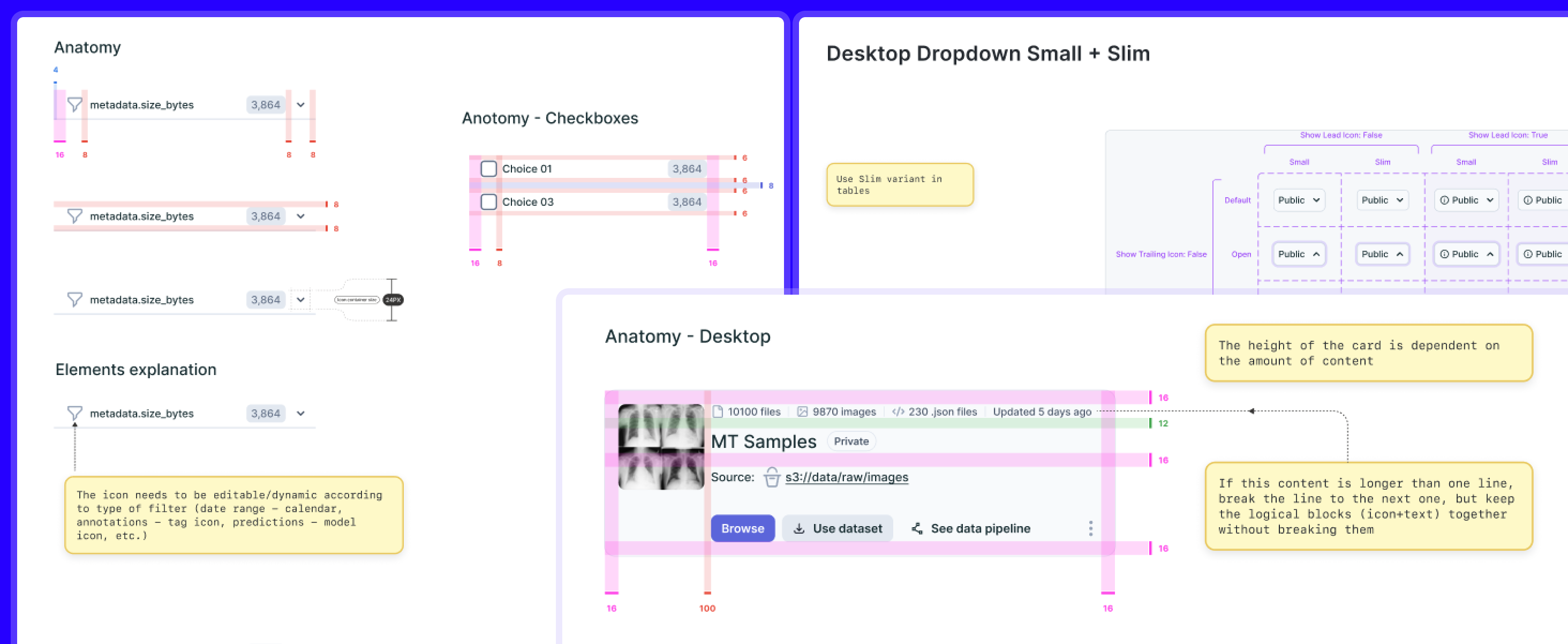
Documenting my design decisions and implementation considerations to save dev time later
Impact
DagsHub Design System has started to be implemented in Storybook. It took a while, and several developers switching each other, but many of the components have been implemented.
- Built a foundation for scalability and future collaboration
- Enabled faster onboarding for new devs via a well-documented system
There are many nuances that need to be re-considered for the implementation part, including naming conventions, component hierarchy and folder structure, but overall we have built solid foundation for the future work.
200+
Styles + variables
1K+
Component variables
3+
Layout templates